


You can keep a Shopify feed consistent without a designer. Copy your logo, colors, and slogan from Shopify’s Brand assets onto one page, build three post templates from that page, and reuse them for two weeks on the two platforms you already post on. That is Guide-Template-Repeat, and it fixes the grid that looks like four different stores.
The problem shows up after you start posting, not before. A fragrance founder described it in a Shopify Community thread: they struggle to create consistent social media posts without a designer, and for them it is “mainly the visuals like colors, layouts and overall feed harmony” (Shopify Community).
One reply in that thread gave the fix this guide is built on: “create a brand guideline” with “core elements such as logo, colour palette, text font,” then “create a few templates” and reuse them. That is one reply in one thread, not a poll. It is also a fix one person can run alone.
Most of the raw material is already in your admin. Shopify’s Brand assets page, under Settings > General, holds your logos, colors, slogan, and a short description. Shopify says a square logo is required for social media channels and profile pictures, and that it might be cropped to a circle (Shopify Help).
Key Takeaways
- Start in Brand assets: Copy your logo, HEX colors, and slogan from Shopify Brand assets onto one page before you design a post.
- Two fonts, three layout rules: Lock them in. That is the whole guide.
- Three templates only: Product, proof, and education. Reuse them.
- Same two platforms: Do not open a third to “fix” the grid.
Why social branding matters now
If you followed how to start social media for a Shopify store, you already claimed your profiles, chose two platforms, and published a starter batch. You are posting. The next stall is rarely captions. It is visuals.
The founder in that thread says as much. Tone and storytelling matter, but visuals are harder to keep consistent without design support, “especially when posting regularly.” Posting regularly is the trigger. One post in a random style disappears. Twelve posts in twelve styles become a grid that looks like four different stores.
Fall and holiday campaigns add posts fast, and every rushed post is a chance for a new style to creep in.
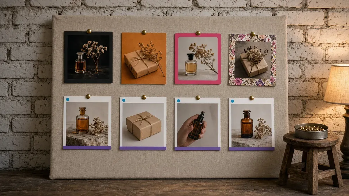
Shopify already stores the parts that fix this. Brand assets can hold primary, secondary, and contrasting colors, which Shopify says can be used on your online store or social media. They also hold a slogan of up to 80 characters and a short description of up to 150 characters that Shopify says is often used in bios (Shopify Help).
The gap is not the assets. The gap is using them on every post.
The Guide-Template-Repeat framework
Guide-Template-Repeat is a visual system one person can run. Write one page, build three frames from it, then reuse the frames for two weeks without restyling them.
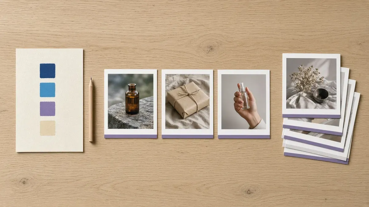
Guide: what goes on the one page?
Goal: decide once, so you never decide in the middle of a post.
In your Shopify admin, go to Settings > General and click Manage in the Brand assets section. Copy these onto one page, in a doc or on paper:
- Square logo rule: Shopify requires a square logo for social media channels and profile pictures. It must be PNG or JPEG, and Shopify recommends at least 512x512px. It might be cropped to a circle, so keep the mark away from the corners.
- Primary HEX: The exact code, not “our blue.”
- Secondary HEX: One is enough. On the Starter plan, Shopify says secondary colors are not available, so use your primary and its contrasting color.
- Slogan: Up to 80 characters.
- Bio line: Your short description, up to 150 characters.
Next, add the two fonts your store already uses. Go to Online Store > Themes, click Edit theme, open Theme settings, and click Typography. The Headings and Body sections show your storefront fonts (Shopify Help). Those are your two fonts. Do not pick a third one for social.
Finish with three layout rules:
- Same margin: Every frame has the same border width.
- Same logo corner: The logo sits in one corner and never moves.
- Same text band: Text lives in one band, top or bottom, in one of your colors.
Stop there. The guide is one page because a longer guide is one you will not open on a busy Tuesday.
Template: which three frames do you need?
Goal: turn the page into frames you only fill in.
Build three templates in Canva or your phone’s photo editor. Each one obeys the guide.
- Product: Product photo, product name, one benefit. “Cedar and fig, a warm scent for cold mornings” is a benefit. “Amazing new scent!!” is not.
- Proof: A review or a packing shot, with one short line in the same band.
- Education: One tip in the band, over a photo in your colors. How to layer a scent. How to store a candle. One tip per post.
No fourth template this month. A fourth frame is where restyling sneaks back in.
The frames fix how posts look, not what they say. If your captions are the weaker half, use product captions that convert for the words under the frame.
Repeat: how long before you change anything?
Goal: let the grid prove the system before you touch it.
Post from those three frames for two weeks on the same two platforms you chose when you started. Change the photo and the line. Do not restyle the frame.
That rule is the hard one. The Community reply makes the same point: keep the templates and just change the content for each post. Around day eight, the frame will feel stale to you, because you see it every time you make a post. Someone seeing your third post has seen it three times. Leave it.
At the end of two weeks, judge the grid, not a single post. If it reads as one store, the system works.
Worked example: set it up in one session
Here is the setup for a small fragrance store, the same kind of shop as the Community thread. Swap in any product you already photograph. You are not shooting anything new, and the whole session fits in 30 to 60 minutes.
| Time | Step | Done when |
|---|---|---|
| 0 to 15 min | Open Settings > General > Brand assets. Write the HEX codes, the slogan, and the square logo note on one page. Add your two theme fonts. | One page, no blanks |
| 15 to 35 min | Build the three templates: same margin, same text band, same two fonts, logo in the same corner. | Product, proof, and education frames saved |
| 35 to 50 min | Drop six existing product photos into the product template. | Six product posts ready |
| 50 to 60 min | Queue two weeks on your two platforms, rotating product, proof, and education. | Two weeks scheduled |
What does the one page look like?
For the fragrance store, the finished page reads like this. The codes are examples. Use yours from Brand assets.
- Square logo: PNG, 512x512px, mark centered so a circle crop keeps it whole
- Primary: #2B2A4C, with #F4EFE6 as its contrasting color
- Secondary: #8C6BB1
- Slogan: “Small-batch scents for slow mornings”
- Bio line: “Hand-blended fragrance in small batches, packed in our studio.”
- Fonts: The theme’s heading font for product names, the body font for everything else
- Layout: Same white margin on every frame, logo bottom right, text band along the bottom in the primary color
What does the two-week rotation look like?
Six product posts, two proof posts, and two education posts fill two weeks at five posts a week.
| Day | Week 1 | Week 2 |
|---|---|---|
| Monday | Product | Product |
| Tuesday | Proof | Education |
| Wednesday | Product | Product |
| Thursday | Education | Proof |
| Friday | Product | Product |
Put the rotation on your Shopify social media content calendar so the frames, not the day’s mood, decide what goes out.
Two platforms max: the same pair you already chose
Keep this on the two platforms you picked with Claim-Choose-Create-Check. Your frames are how people recognize you there.
On Instagram, the feed runs the three templates. Instagram Stories can reuse the product frame as a still. Make one vertical version with the same margin, band, and logo corner, so a Story and a feed post look like the same store.
On your second platform, post the same frames. Do not redesign them per platform. Consistency across two places is the point.
Do not open TikTok as a third “brand fix.” A new platform does not fix how your grid looks. It adds a third grid to keep consistent.
Video is a different job. These frames are for stills. When you are ready for motion, Instagram Reels for Shopify stores covers the clips. Keep your colors, but do not force Reels through a still template.
If the product frame starts pulling “is this still available?” messages, answer them with the Instagram DM sales playbook.
Common mistakes that break a consistent feed
Restyling the frame every post. The last one “felt stale” because you look at it every time you make a post. Your followers saw it once. Change the photo, keep the frame.
Using a wide logo as the profile photo. Shopify says the square logo is the one for social media channels and profile pictures, and it might be cropped to a circle. A wide wordmark shrinks into a strip nobody can read. Use the square version.
Picking new HEX codes in Canva. A “close enough” purple is a new color. Paste the codes from Brand assets every time.
Opening a third platform to make the brand look bigger. Three half-kept grids look smaller than two consistent ones.
Starting with a brand kit feature instead of the page. Design apps, schedulers, and Shopify itself can store logos and colors. None of them decides your two fonts or your logo corner. Write the page first, then load it into whichever tool you use.
Starting over instead of reusing. You do not need new accounts or a new shoot to fix the grid. Account setup is Claim-Choose-Create-Check, and the shoot list lives in how to turn product photos into scroll-stopping social content. Guide-Template-Repeat uses the photos you already have.
Put Guide-Template-Repeat to work this week
- Guide: Open Brand assets today. Fill the one page: square logo rule, HEX codes, slogan, bio line, two fonts, three layout rules.
- Template: Build the product, proof, and education frames once.
- Repeat: Schedule two weeks from those frames on your two platforms. Change the photo and the line, never the frame.
Then leave it alone for fourteen days and look at the grid.
If you want the two weeks on one screen, IDEQO’s free content calendar can lay out the product, proof, and education rotation, and IDEQO can schedule every post before the first one goes out. Start free with IDEQO. Free plan available. No credit card required.
Frequently Asked Questions
Do I need a designer for a consistent Shopify feed?
No. In a Shopify Community thread about exactly this problem, one reply suggested creating a brand guideline with core elements such as logo, colour palette, and text font, then creating a few templates and reusing them. Guide-Template-Repeat turns that advice into a routine: one page, three templates, and two weeks without restyling.
Where do I find my store's official colors and logo in Shopify?
In your Shopify admin, go to Settings > General and click Manage in the Brand assets section. That page holds your logos, colors, slogan, and short description. Shopify's Help Center page on managing brand assets says a square logo is required for social media channels and profile pictures, and that it might be cropped to a circle.
Is this the same as starting social media for my store?
No. IDEQO's guide to starting social media for a Shopify store uses Claim-Choose-Create-Check to set up profiles, pick two platforms, and publish a starter batch. Guide-Template-Repeat comes after that. It is the visual system for a store that is already posting.
How many social media templates does a Shopify store need?
Three: product, proof, and education. Product is a photo, the product name, and one benefit. Proof is a review or a packing shot. Education is one tip in your colors. Add a fourth only after two full weeks on the first three.
What if my product photos still look flat inside the templates?
Then the photos are the problem, not the frame. IDEQO's guide to turning product photos into social content covers a 5-format shoot for that. Keep your three templates and swap in better photos as you shoot them.